
Creating a Shared Language for Duolingo
Creating a Shared Language for Duolingo
Creating a Shared Language for Duolingo
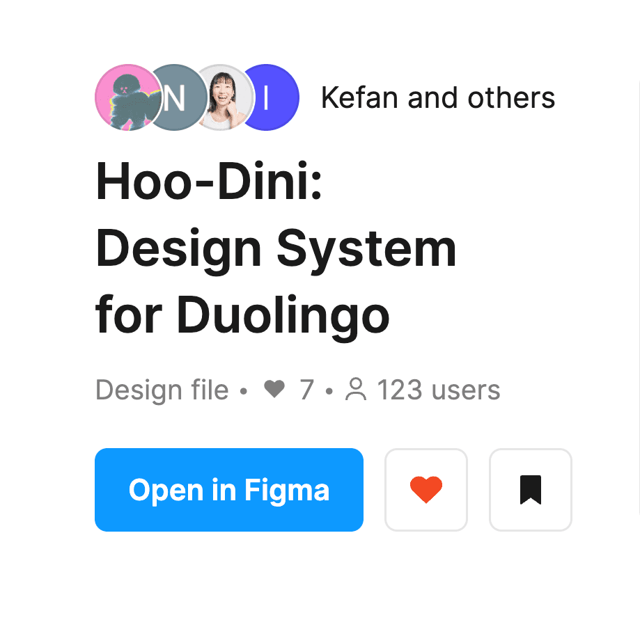
Hoo-Dini Design System
Hoo-Dini Design System
Hoo-Dini Design System
UX Designer
UX Designer
UX Designer
UI Audit, Accessibility, Component Design
UI Audit, Accessibility, Component Design
Team
Team
Team
4 Designers
4 Designers
Duration
Duration
Duration
3 months
Sep - Dec 2024
3 months
Sep - Dec 2024
Tools
Tools
Tools
Figma
Figjam
Zeroheight
Figma
Figjam
Zeroheight
Deliverables
Deliverables
Deliverables

The Problem
The Problem
The Problem
Duolingo’s interfaces show visual inconsistencies and accessibility gaps, slowing teams down and confusing users.
Duolingo’s interfaces show visual inconsistencies and accessibility gaps, slowing teams down and confusing users.
Duolingo’s interfaces show visual inconsistencies and accessibility gaps, slowing teams down and confusing users.
Our Solution
Our Solution
Our Solution
We created Hoo-Dini, an unofficial design system that brings structure, clarity, and scalability to Duolingo using atomic design and accessibility principles.
We created Hoo-Dini, an unofficial design system that brings structure, clarity, and scalability to Duolingo using atomic design and accessibility principles.
We created Hoo-Dini, an unofficial design system that brings structure, clarity, and scalability to Duolingo using atomic design and accessibility principles.
The Impact
The Impact
The Impact
164 usages in real design workflows (steadily going ⬆️)
164 usages in real design workflows (steadily going ⬆️)
164 usages in real design workflows (steadily going ⬆️)
PAIN POINTS
PAIN POINTS
PAIN POINTS
Aren’t Duolingo’s brand guidelines sufficient?
Aren’t Duolingo’s brand guidelines sufficient?
Aren’t Duolingo’s brand guidelines sufficient?
For brand identity, YES.
For brand identity, YES.
For brand identity, YES.
For consistency, efficiency, scalability, and accessibility, NO.
For consistency, efficiency, scalability, and accessibility, NO.
For consistency, efficiency, scalability, and accessibility, NO.
Imagine you open the files only to see inconsistent icon usage, you browse the guidelines only to find icons’ SVG download links.
Imagine you open the files only to see inconsistent icon usage, you browse the guidelines only to find icons’ SVG download links.
Imagine you open the files only to see inconsistent icon usage, you browse the guidelines only to find icons’ SVG download links.
But where are the REAL designer-centered guidelines?
But where are the REAL designer-centered guidelines?
But where are the REAL designer-centered guidelines?
OUR PROCESS
OUR PROCESS
OUR PROCESS
We crafted a design system through:
We crafted a design system through:
01 AUDIT
01 AUDIT
01 AUDIT
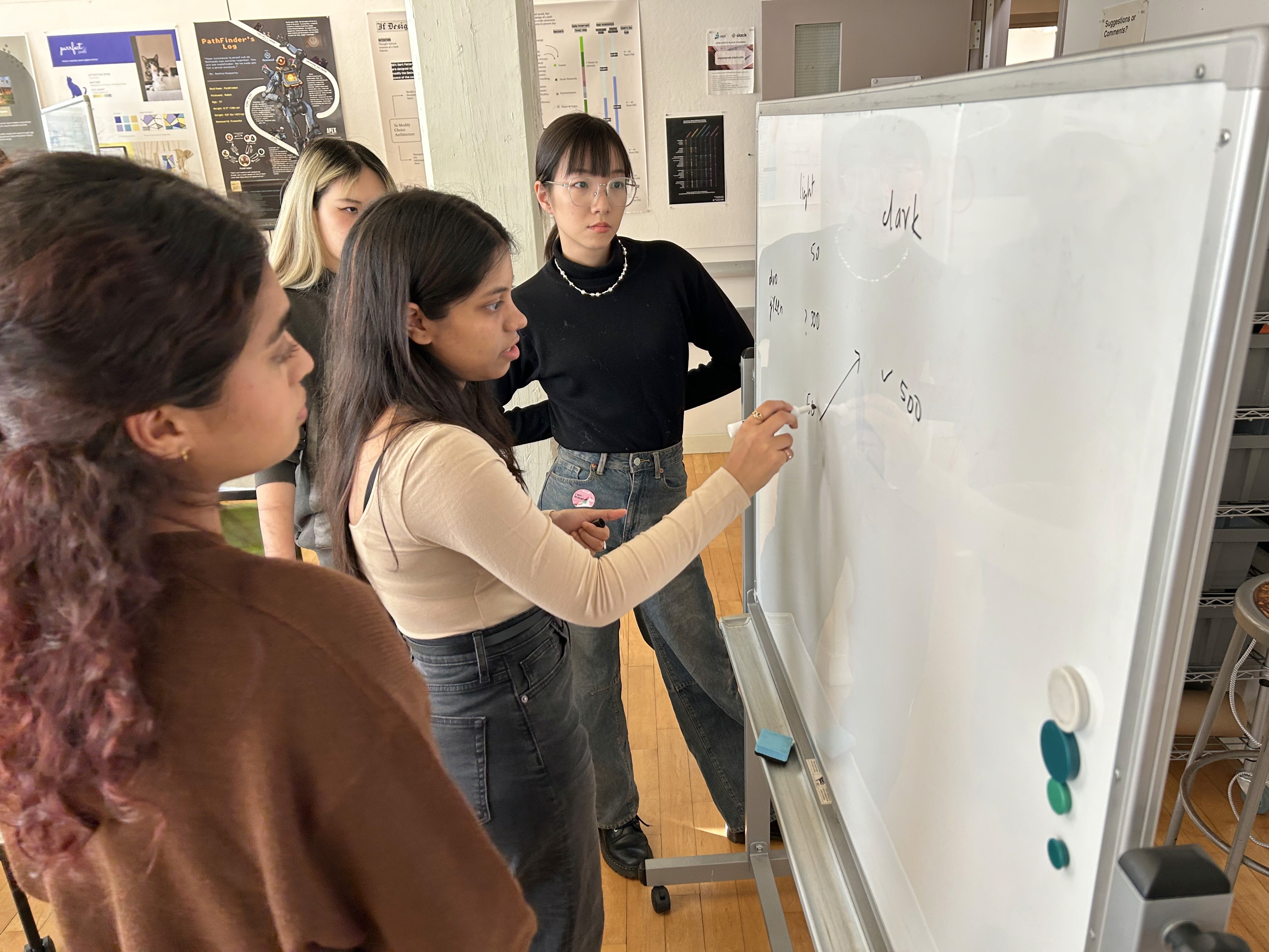
Started by deconstructing UI to create an inventory
Started by deconstructing UI to create an inventory
Started by deconstructing UI to create an inventory
1. Screenshot
1. Screenshot
1. Screenshot
Individually, we screenshot every unique UI element and categorized them along the way.
Individually, we screenshot every unique UI element and categorized them along the way.
Individually, we screenshot every unique UI element and categorized them along the way.

2. Consolidate
2. Consolidate
2. Consolidate
As a team, we consolidated our UI libraries into the team’s holistic interface inventory.
As a team, we consolidated our UI libraries into the team’s holistic interface inventory.
As a team, we consolidated our UI libraries into the team’s holistic interface inventory.

3. Identify
3. Identify
3. Identify
We conducted an audit on the inventory to pinpoint current gaps, inconsistencies, and accessibility issues.
We conducted an audit on the inventory to pinpoint current gaps, inconsistencies, and accessibility issues.
We conducted an audit on the inventory to pinpoint current gaps, inconsistencies, and accessibility issues.


The audit helped us clarify priorities and key issues to address in later building the system:
The audit helped us clarify priorities and key issues to address in later building the system:
The audit helped us clarify priorities and key issues to address in later building the system:
Standardization
Standardization
Standardization

Elements of similar functionalities vary in specific contexts, with inconsistencies in colors, layouts, spacing, sizes, etc.
Elements of similar functionalities vary in specific contexts, with inconsistencies in colors, layouts, spacing, sizes, etc.
Elements of similar functionalities vary in specific contexts, with inconsistencies in colors, layouts, spacing, sizes, etc.
Modularity
Modularity
Modularity

Lacking a structured, modular, and hierarchical token system to govern design choices.
Lacking a structured, modular, and hierarchical token system to govern design choices.
Lacking a structured, modular, and hierarchical token system to govern design choices.
Accessibility
Accessibility
Accessibility

Color combinations fail to meet WCAG contrast accessibility standards, even for the exit text intended for improving accessibility.
Color combinations fail to meet WCAG contrast accessibility standards, even for the exit text intended for improving accessibility.
Color combinations fail to meet WCAG contrast accessibility standards, even for the exit text intended for improving accessibility.
02 BUILD & TEST
02 BUILD & TEST
02 BUILD & TEST
Built our standardized, hierarchical, and accessible UI kit
Built our standardized, hierarchical, and accessible UI kit
Built our standardized, hierarchical, and accessible UI kit
DESIGN PRINCIPLES & BRANDING
DESIGN PRINCIPLES & BRANDING
DESIGN PRINCIPLES & BRANDING
With the foundation set by the interface inventory, we moved on to define our guiding design principles to align team goals and brand values.
With the foundation set by the interface inventory, we moved on to define our guiding design principles to align team goals and brand values.
With the foundation set by the interface inventory, we moved on to define our guiding design principles to align team goals and brand values.


Magical Learning Experiences
Magical Learning Experiences
Magical Learning Experiences
delightful and emotionally engaging
delightful and emotionally engaging
delightful and emotionally engaging

Thoughtful and Intuitive
Thoughtful and Intuitive
Thoughtful and Intuitive
impactful and intuitive for learners of all levels
impactful and intuitive for learners of all levels
impactful and intuitive for learners of all levels


All for One, One for All
All for One, One for All
All for One, One for All
simple, effortless, and non-manipulative
simple, effortless, and non-manipulative
simple, effortless, and non-manipulative

We named our design system Hoo-Dini to reflect the seamless, magical user experiences it enables.
We named our design system Hoo-Dini to reflect the seamless, magical user experiences it enables.
We named our design system Hoo-Dini to reflect the seamless, magical user experiences it enables.
METHODOLOGY
METHODOLOGY
METHODOLOGY
Adopting Brad Frost’s Atomic Design framework, we constructed our UI kit starting from atomic-level tokens, which were pieced together into reusable molecules, and further evolved into bigger chunk organisms.
Adopting Brad Frost’s Atomic Design framework, we constructed our UI kit starting from atomic-level tokens, which were pieced together into reusable molecules, and further evolved into bigger chunk organisms.
Adopting Brad Frost’s Atomic Design framework, we constructed our UI kit starting from atomic-level tokens, which were pieced together into reusable molecules, and further evolved into bigger chunk organisms.

BUILDING UI KIT
BUILDING UI KIT
BUILDING UI KIT
We intentionally narrowed down the scope of our UI kit to address only the most-used features and primary touch points.
We intentionally narrowed down the scope of our UI kit to address only the most-used features and primary touch points.
We intentionally narrowed down the scope of our UI kit to address only the most-used features and primary touch points.


A) Structuring our atomic tokens in 3 levels
A) Structuring our atomic tokens in 3 levels
A) Structuring our atomic tokens in 3 levels
Setting a logical and reliable token system is important, as its interconnectedness enables instant synchronization of updates across molecules, organisms, and so on.
Setting a logical and reliable token system is important, as its interconnectedness enables instant synchronization of updates across molecules, organisms, and so on.
Setting a logical and reliable token system is important, as its interconnectedness enables instant synchronization of updates across molecules, organisms, and so on.
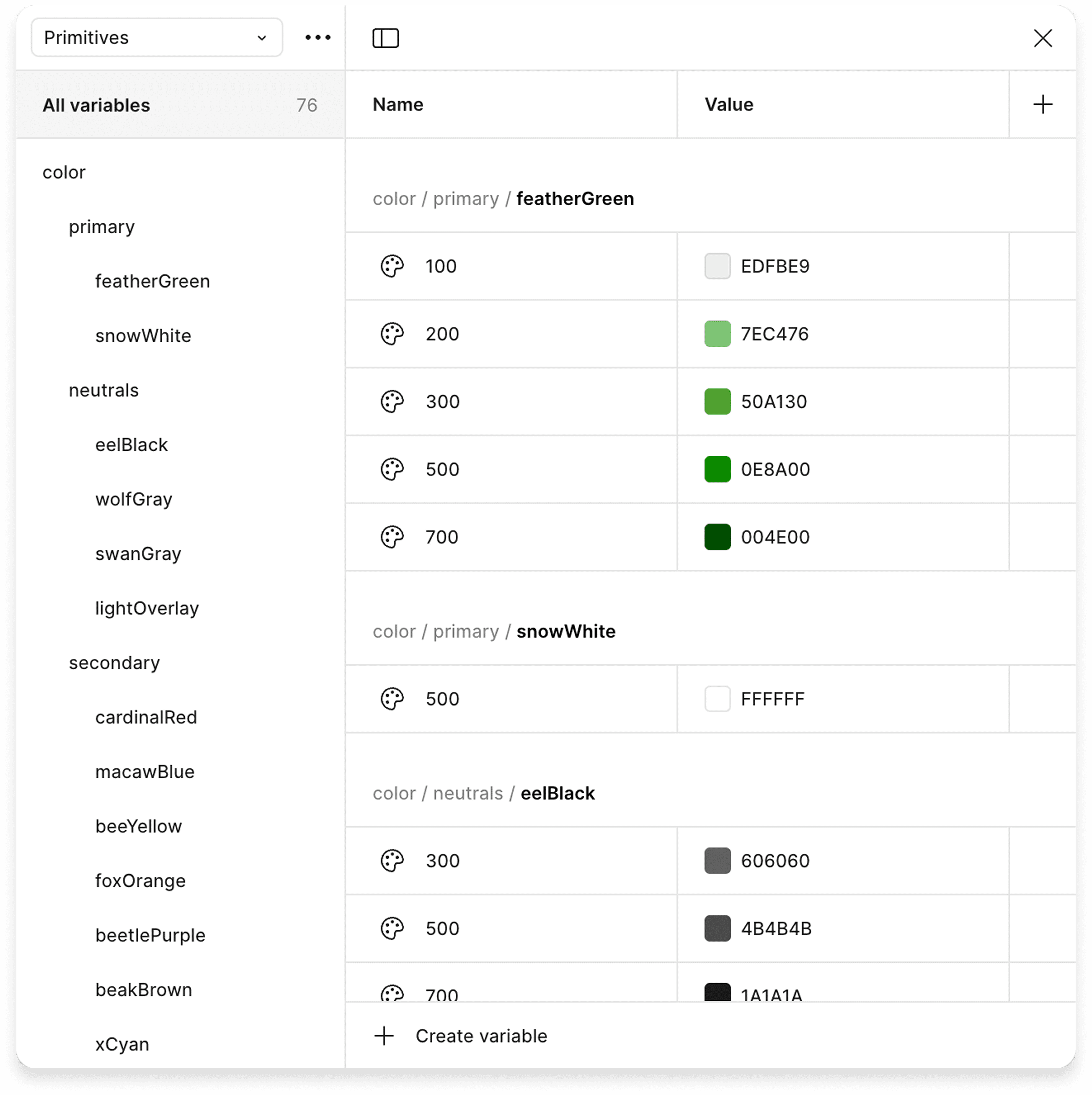
We revised Duolingo’s existing atoms (colors, typography, etc.) to ensure accessibility, functionality, and efficiency.
We revised Duolingo’s existing atoms (colors, typography, etc.) to ensure accessibility, functionality, and efficiency.
We revised Duolingo’s existing atoms (colors, typography, etc.) to ensure accessibility, functionality, and efficiency.

We were able to unify and scale its primary & secondary colors into a 5-tier palette, and neutrals to 3-tier. With accessibility in mind, we adapted the values to ensure color combination usage passes WCAG AA accessibility standards.
We were able to unify and scale its primary & secondary colors into a 5-tier palette, and neutrals to 3-tier. With accessibility in mind, we adapted the values to ensure color combination usage passes WCAG AA accessibility standards.


Similarly, we defined typography, spacing, corner radius, icons, and border width values to speed up design work.
Similarly, we defined typography, spacing, corner radius, icons, and border width values to speed up design work.
Similarly, we defined typography, spacing, corner radius, icons, and border width values to speed up design work.
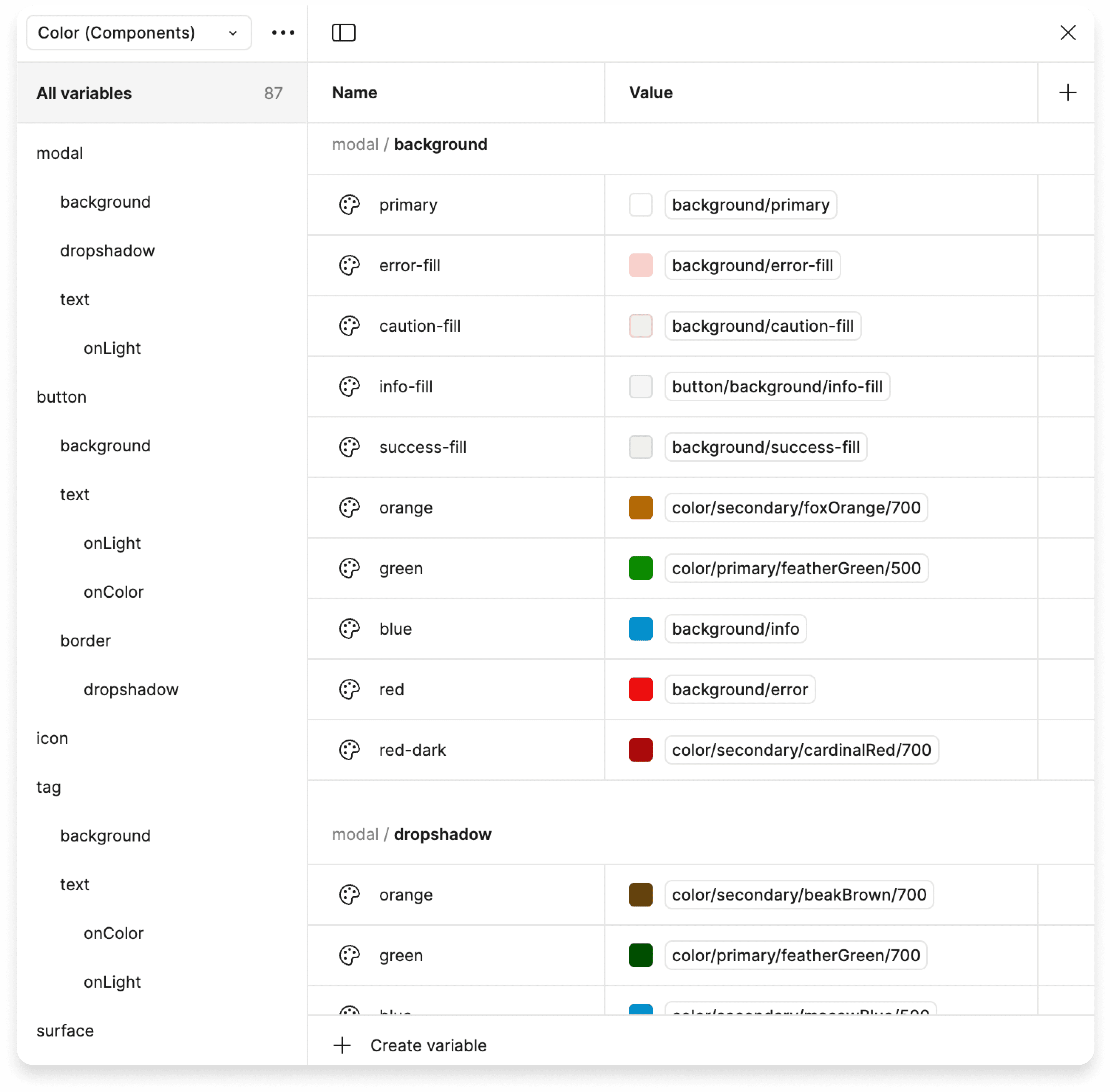
We then organized the recomposed atoms into a 3-level token system and realized it using Figma variables:
We then organized the recomposed atoms into a 3-level token system and realized it using Figma variables:
We then organized the recomposed atoms into a 3-level token system and realized it using Figma variables:

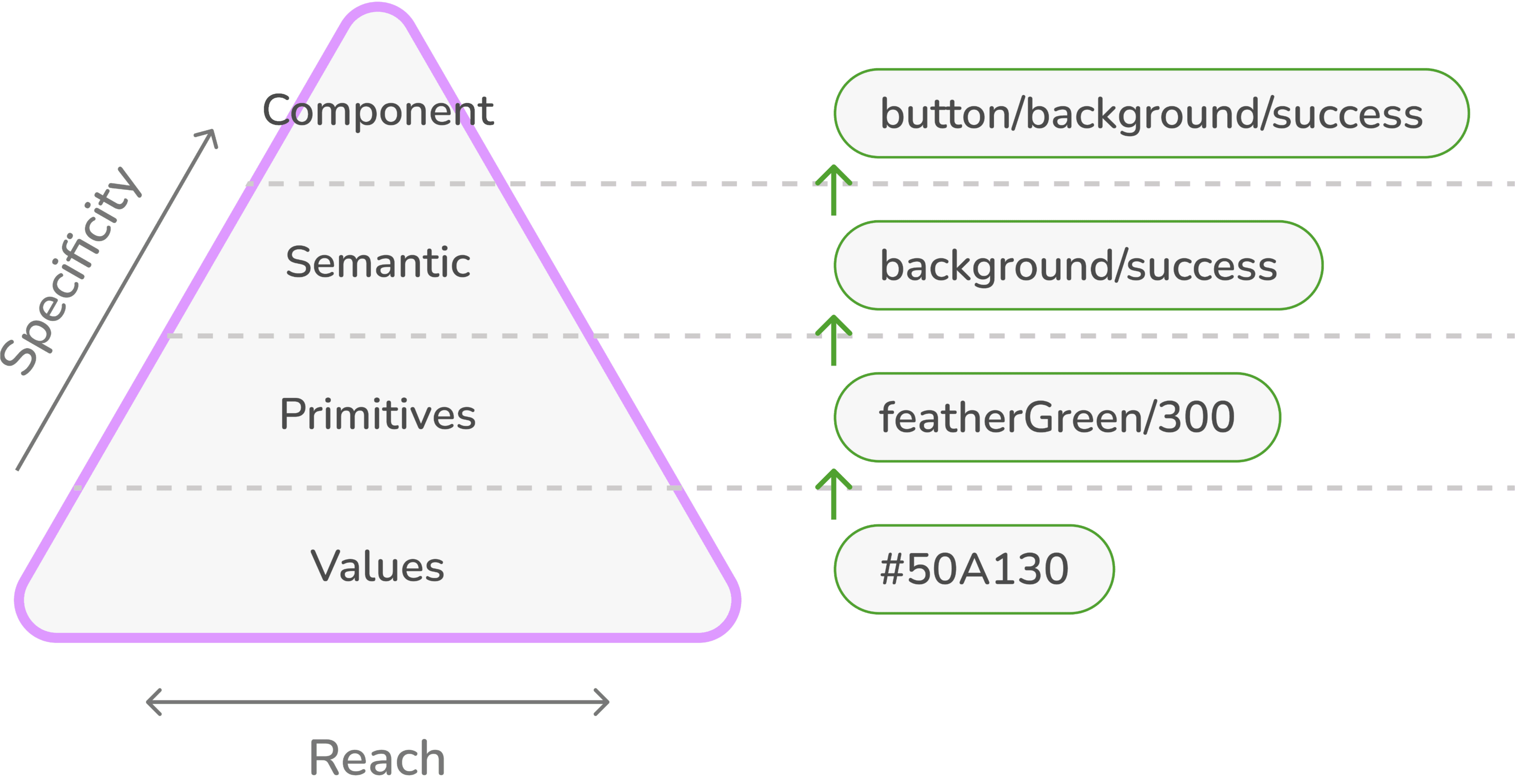
Primitives:
base tokens that abstract raw values into descriptive names
Primitives:
base tokens that abstract raw values into descriptive names
Primitives:
base tokens that abstract raw values into descriptive names
Semantic Tokens:
defined by their roles and purposes
Semantic Tokens:
defined by their roles and purposes
Semantic Tokens:
defined by their roles and purposes
Component Tokens:
specific and contextual tokens directly tied to components or states
Component Tokens:
specific and contextual tokens directly tied to components or states
Component Tokens:
specific and contextual tokens directly tied to components or states


B) Piecing atoms together to create modules
B) Piecing atoms together to create modules
B) Piecing atoms together to create modules
We replicated Duolingo’s existing components applying our atomic values, and made tweaks wherever needed to fit our framework.
We replicated Duolingo’s existing components applying our atomic values, and made tweaks wherever needed to fit our framework.
We replicated Duolingo’s existing components applying our atomic values, and made tweaks wherever needed to fit our framework.
Leveraging Figma’s Properties and Auto Layout, we worked iteratively and simplified Hoo-Dini’s asset library to only include necessary, unique components, with variants covering all different states, color, or trivial variations.
Leveraging Figma’s Properties and Auto Layout, we worked iteratively and simplified Hoo-Dini’s asset library to only include necessary, unique components, with variants covering all different states, color, or trivial variations.
Leveraging Figma’s Properties and Auto Layout, we worked iteratively and simplified Hoo-Dini’s asset library to only include necessary, unique components, with variants covering all different states, color, or trivial variations.


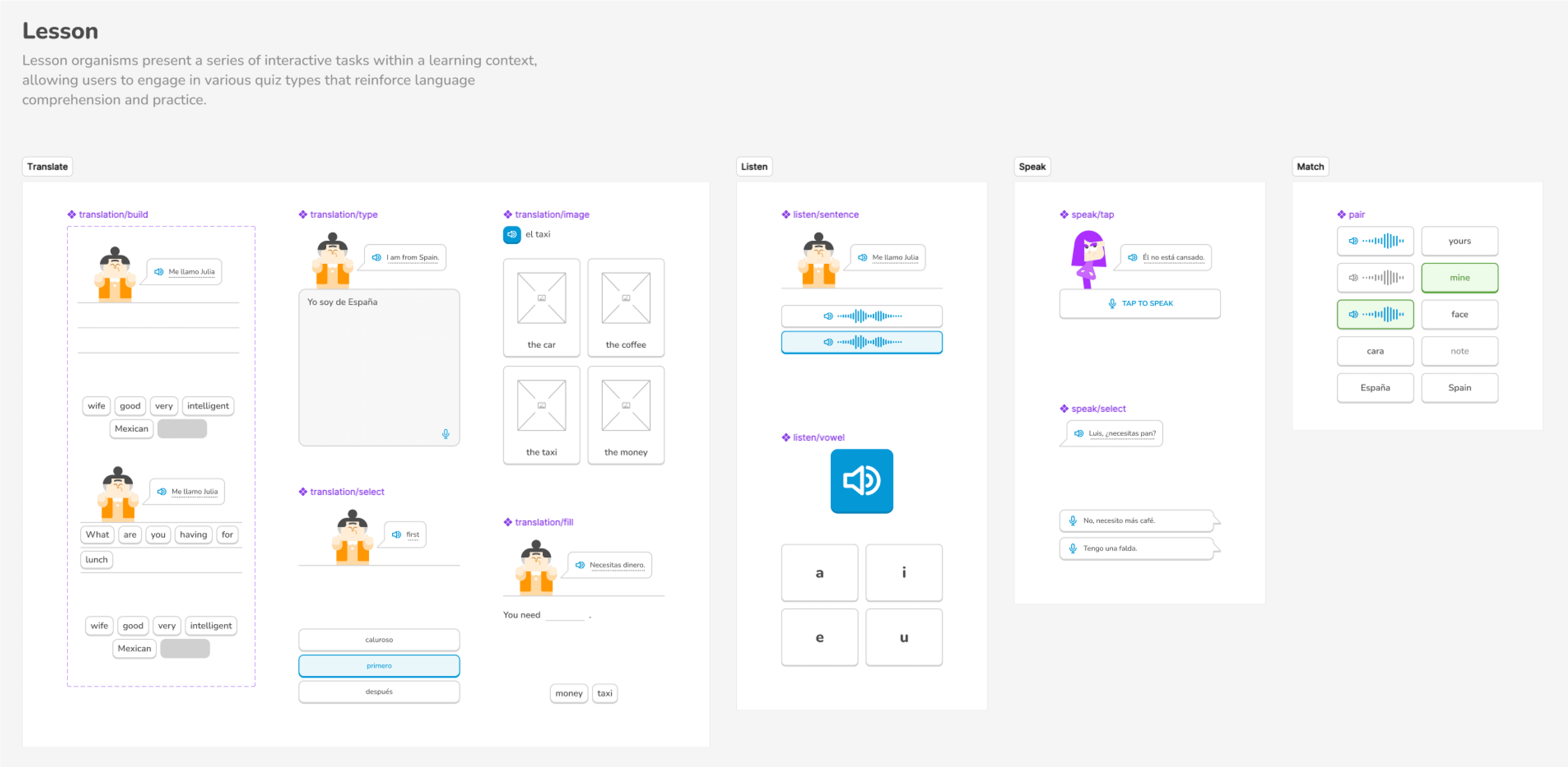
C) Building organisms by assembling modules
C) Building organisms by assembling modules
C) Building organisms by assembling modules
Organism-level components are larger compositions for specific use cases, combining atoms and modules in meaningful ways. For instance, lesson organisms consist of, but are not limited to, utterance chips, response chips, illustrations, and icons.
Organism-level components are larger compositions for specific use cases, combining atoms and modules in meaningful ways. For instance, lesson organisms consist of, but are not limited to, utterance chips, response chips, illustrations, and icons.
Organism-level components are larger compositions for specific use cases, combining atoms and modules in meaningful ways. For instance, lesson organisms consist of, but are not limited to, utterance chips, response chips, illustrations, and icons.
These preconfigured organisms will enable a much more streamlined user experience for building highly repetitive screens.
These preconfigured organisms will enable a much more streamlined user experience for building highly repetitive screens.
These preconfigured organisms will enable a much more streamlined user experience for building highly repetitive screens.


D) Is the UI kit ready for use?
D) Is the UI kit ready for use?
D) Is the UI kit ready for use?
WAIT. Design system is a product, too. It means our users—designers, should be able to actually use it without usability issues.
WAIT. Design system is a product, too. It means our users—designers, should be able to actually use it without usability issues.
WAIT. Design system is a product, too. It means our users—designers, should be able to actually use it without usability issues.
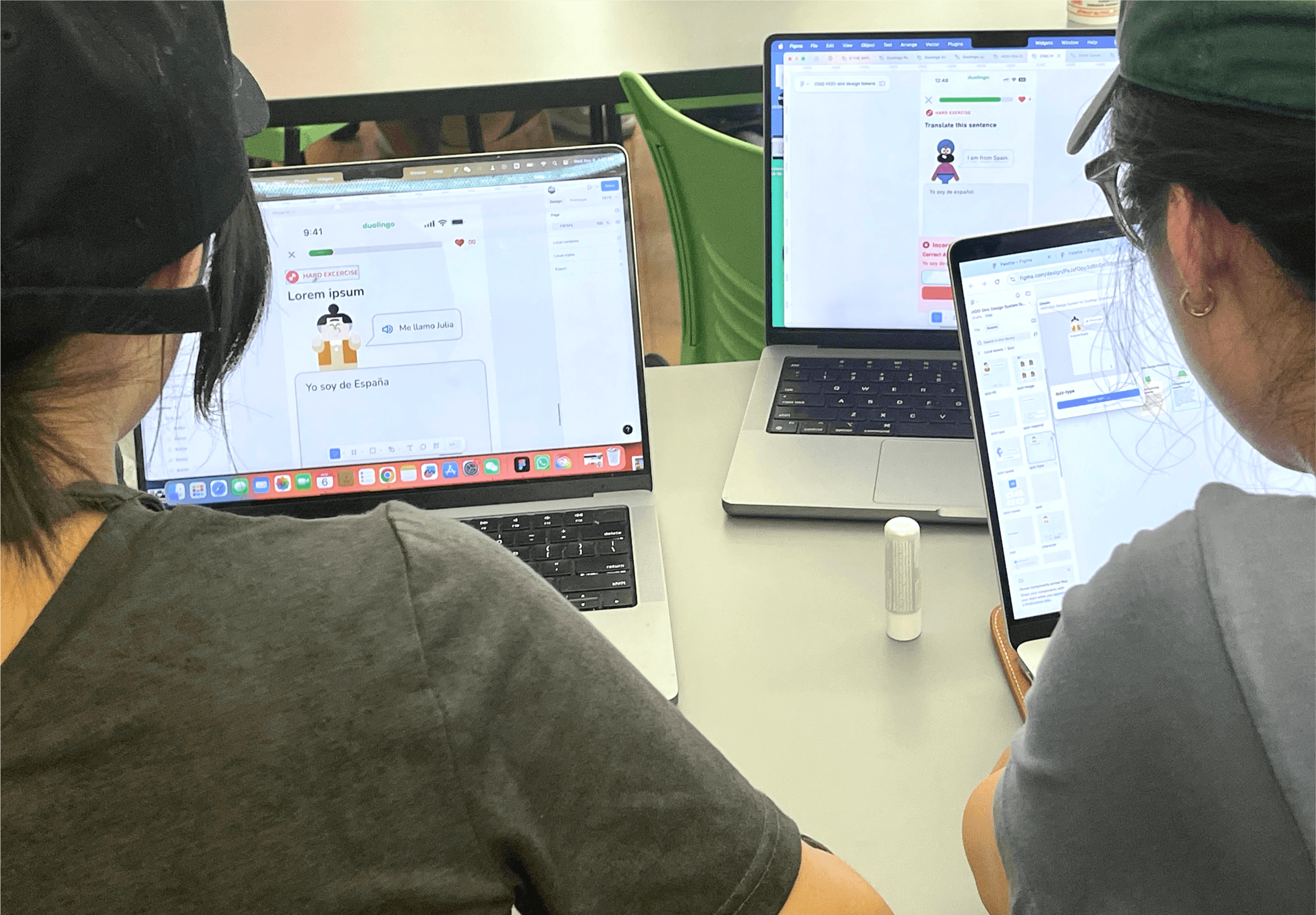
We published our first version of UI kit to Figma Community, and prompted 8 designers to recreate Duolingo interfaces using the kit. Observing how they navigated and implemented the templates provided actionable insights.
We published our first version of UI kit to Figma Community, and prompted 8 designers to recreate Duolingo interfaces using the kit. Observing how they navigated and implemented the templates provided actionable insights.
We published our first version of UI kit to Figma Community, and prompted 8 designers to recreate Duolingo interfaces using the kit. Observing how they navigated and implemented the templates provided actionable insights.

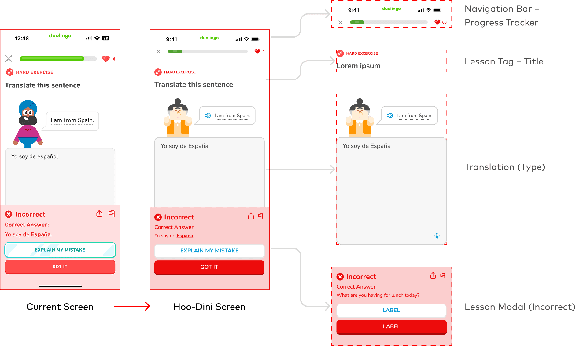
Based on the feedback, we iterated on the UI kit to address missing elements, optimized label consistency & intuitiveness, and rearranged the file layout to be more systematic.
Based on the feedback, we iterated on the UI kit to address missing elements, optimized label consistency & intuitiveness, and rearranged the file layout to be more systematic.
Based on the feedback, we iterated on the UI kit to address missing elements, optimized label consistency & intuitiveness, and rearranged the file layout to be more systematic.
Check out our final UI kit!
Check out our final UI kit!
03 DOCUMENT
03 DOCUMENT
03 DOCUMENT
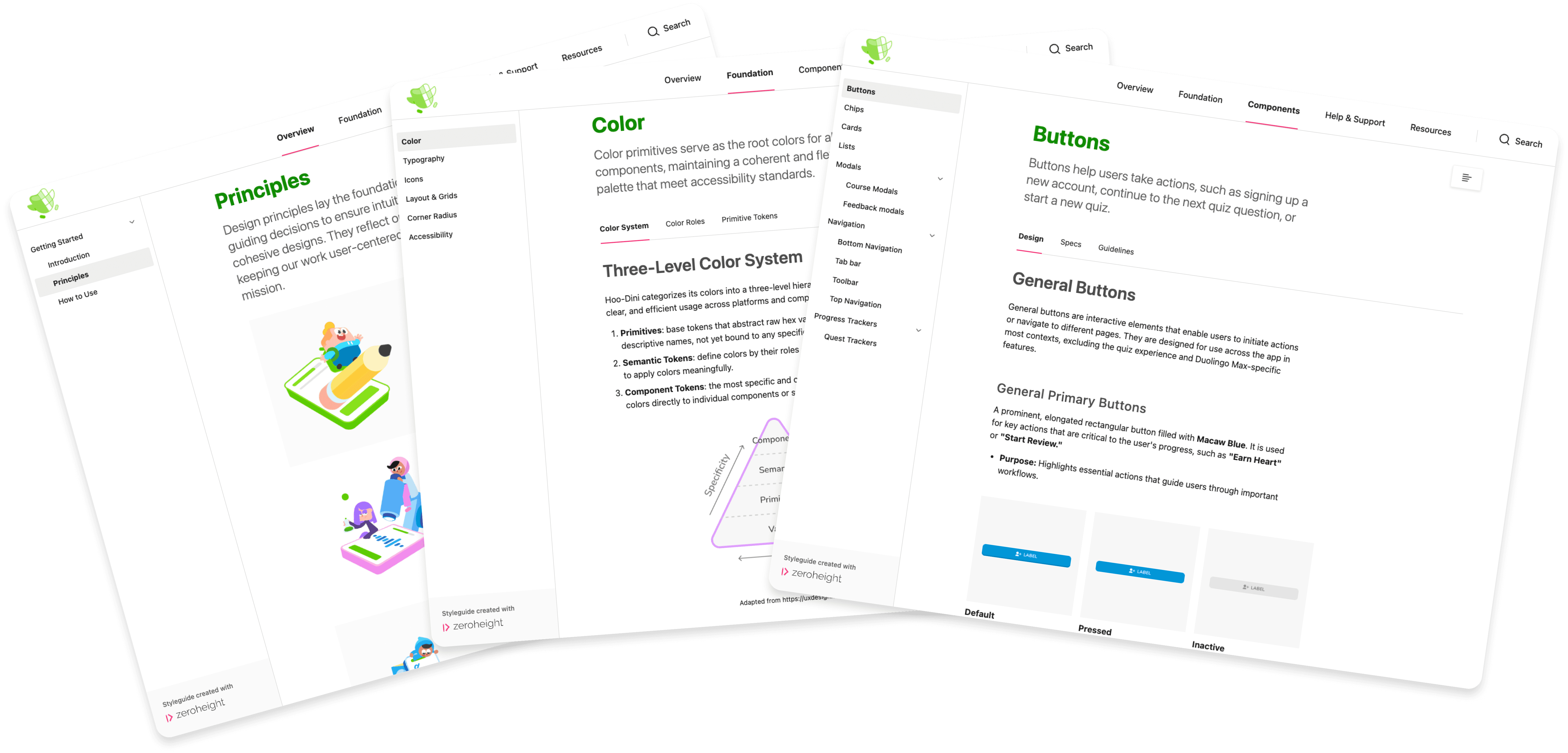
Then we empower users with readily available documentation
Then we empower users with readily available documentation
What if new hires can work with confidence from day one?
What if new hires can work with confidence from day one?
What if new hires can work with confidence from day one?
Without a systematic written guidance, the UI kit is only a collection of scattered assets that cannot be called a design system.
Without a systematic written guidance, the UI kit is only a collection of scattered assets that cannot be called a design system.
Without a systematic written guidance, the UI kit is only a collection of scattered assets that cannot be called a design system.
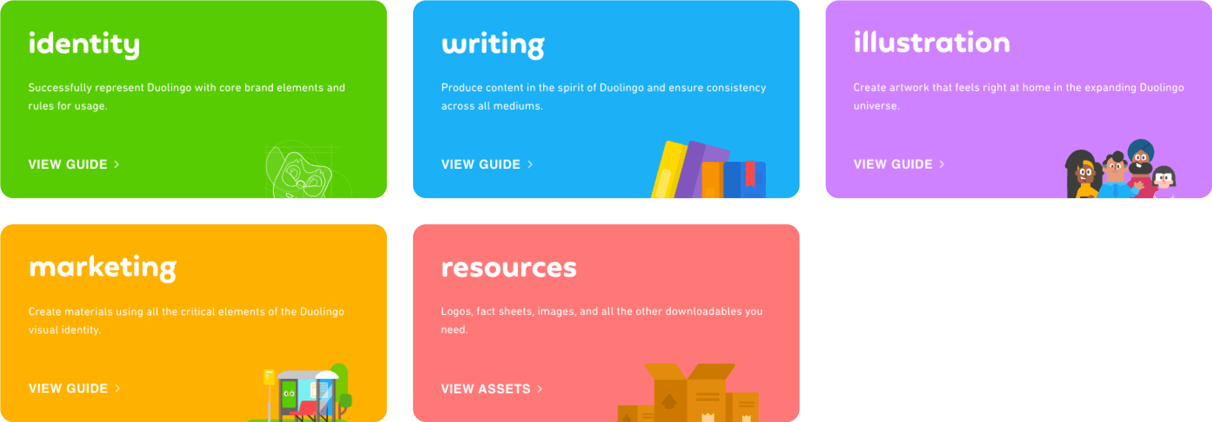
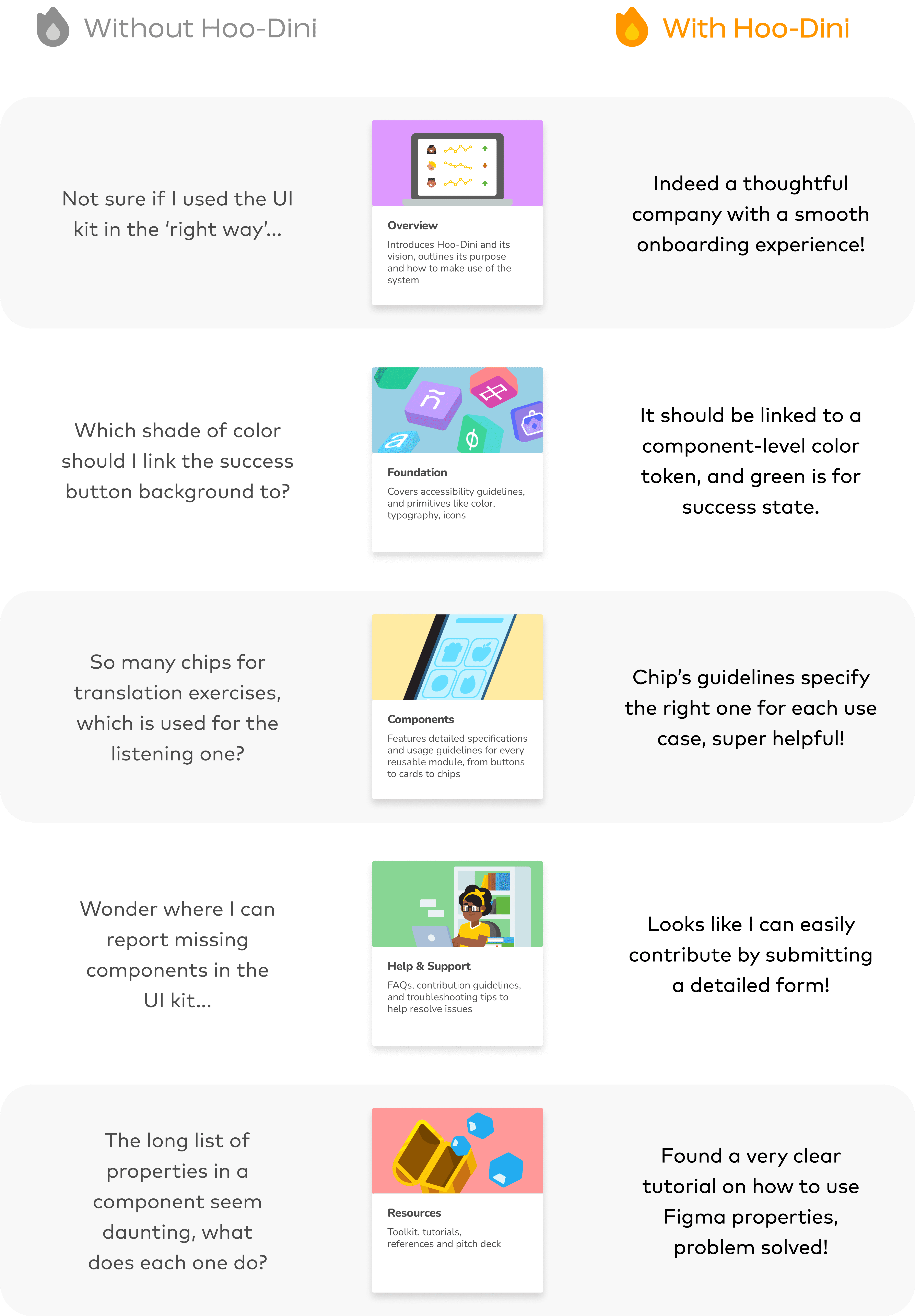
We made our design system come to life in 5 key sections on Zeroheight:
We made our design system come to life in 5 key sections on Zeroheight:
We made our design system come to life in 5 key sections on Zeroheight:

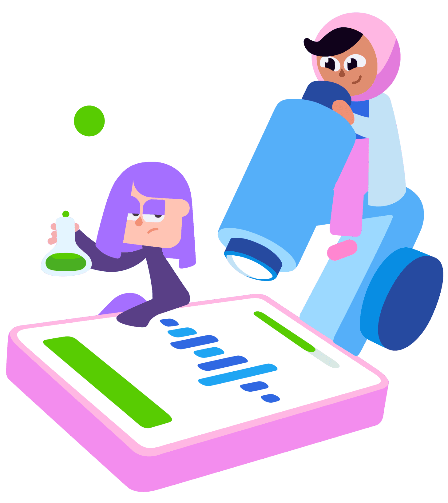
Meet Mia, a new designer at Duolingo
Meet Mia, a new designer at Duolingo
Meet Mia, a new designer at Duolingo
Let’s see how Hoo-Dini can redefine her experience:
Let’s see how Hoo-Dini can redefine her experience:
Let’s see how Hoo-Dini can redefine her experience:

Everything seems done, however, we are left with attracting real users to adopt Hoo-Dini!
Everything seems done, however, we are left with attracting real users to adopt Hoo-Dini!
Everything seems done, however, we are left with attracting real users to adopt Hoo-Dini!
04 SOCIALIZE
04 SOCIALIZE
04 SOCIALIZE
Finally, we pitched Hoo-Dini to engage potential users
Finally, we pitched Hoo-Dini to engage potential users
Finally, we pitched Hoo-Dini to engage potential users

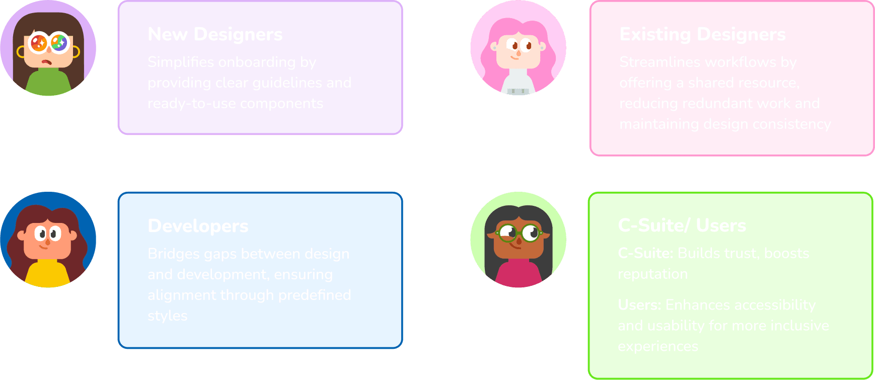
We proudly shared Hoo-Dini with our fellows, showcased the values it can bring to the community, building trust to foster adoption. Feedback was overwhelmingly positive!
We proudly shared Hoo-Dini with our fellows, showcased the values it can bring to the community, building trust to foster adoption. Feedback was overwhelmingly positive!
We proudly shared Hoo-Dini with our fellows, showcased the values it can bring to the community, building trust to foster adoption. Feedback was overwhelmingly positive!

FUTURE & TAKEAWAYS
FUTURE & TAKEAWAYS
FUTURE & TAKEAWAYS
“Culture change disguised as a UI kit” — Lauren LoPrete
“Culture change disguised as a UI kit” — Lauren LoPrete
“Culture change disguised as a UI kit” — Lauren LoPrete
Design systems are far more than…
Design systems are far more than…
Design systems are far more than…
just a collection of reusable UI components, they challenge and reshape organizational workflows, communication, even values. We envision Hoo-Dini driving a cultural shift among designers, developers, and all stakeholders towards system thinking and iterative improvement.
just a collection of reusable UI components, they challenge and reshape organizational workflows, communication, even values. We envision Hoo-Dini driving a cultural shift among designers, developers, and all stakeholders towards system thinking and iterative improvement.
just a collection of reusable UI components, they challenge and reshape organizational workflows, communication, even values. We envision Hoo-Dini driving a cultural shift among designers, developers, and all stakeholders towards system thinking and iterative improvement.
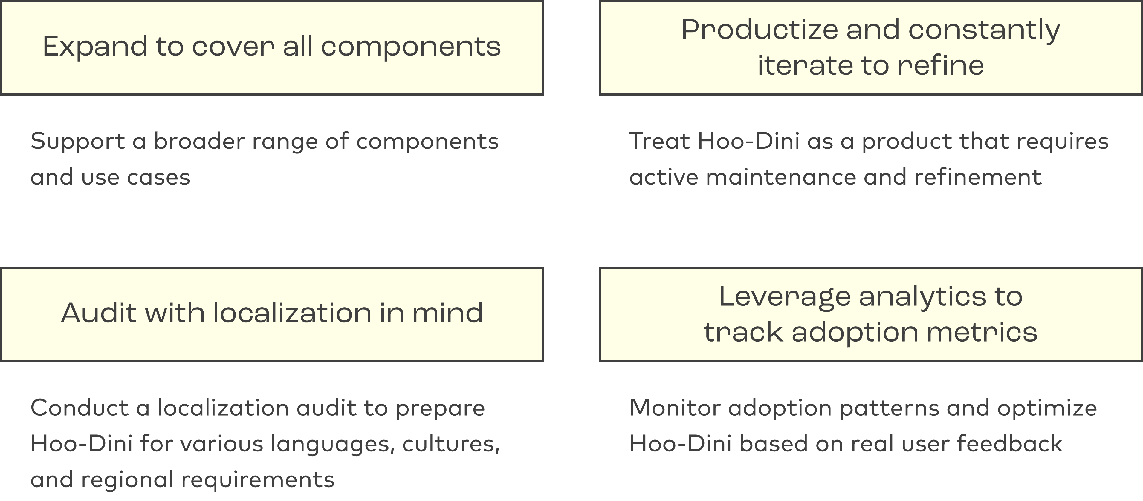
To maintain Hoo-Dini’s cultural impact, the future steps would be to close gaps and evolve it along the way through collective effort:
To maintain Hoo-Dini’s cultural impact, the future steps would be to close gaps and evolve it along the way through collective effort:
To maintain Hoo-Dini’s cultural impact, the future steps would be to close gaps and evolve it along the way through collective effort:
Takeaways
Takeaways
Takeaways
Before this project, I was that “Mia” who built crowded components that could have been variants, who spent valuable time only to reinvent the wheel, and stayed misaligned with the team.
Before this project, I was that “Mia” who built crowded components that could have been variants, who spent valuable time only to reinvent the wheel, and stayed misaligned with the team.
Before this project, I was that “Mia” who built crowded components that could have been variants, who spent valuable time only to reinvent the wheel, and stayed misaligned with the team.
Hoo-Dini has been such an amazing project that reshaped my understanding of design. Through deconstructing, using, and creating one, I gained practical knowledge of how system thinking brings alignment, scalability, and productivity.
Hoo-Dini has been such an amazing project that reshaped my understanding of design. Through deconstructing, using, and creating one, I gained practical knowledge of how system thinking brings alignment, scalability, and productivity.
Hoo-Dini has been such an amazing project that reshaped my understanding of design. Through deconstructing, using, and creating one, I gained practical knowledge of how system thinking brings alignment, scalability, and productivity.
While a solid foundation sets the tone, governance ensures the system evolves sustainably and remains aligned with organizational goals dynamically.
While a solid foundation sets the tone, governance ensures the system evolves sustainably and remains aligned with organizational goals dynamically.
While a solid foundation sets the tone, governance ensures the system evolves sustainably and remains aligned with organizational goals dynamically.
Next Up
Next Up
Next Up

UX Localization Metric
AliExpress

AI Transcription App
Manta Memo
I'm just a message away! 🙌
I'm just a message away! 🙌
I'm just a message away! 🙌
